← All work
Salpica / Identity + packaging
A bold identity for every flavor.
Distinctive lettering, illustrated details and a coordinated color palette connect Salpica’s salsa and queso packaging.
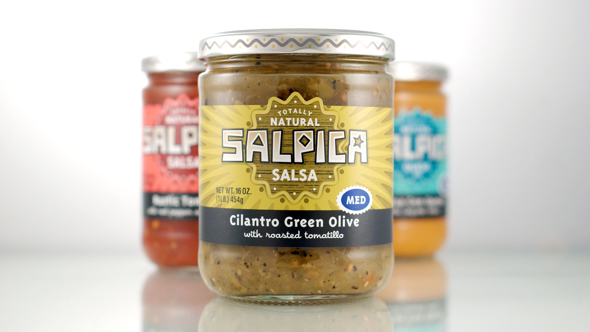
Salpica / Salsa and queso packaging family.
Character in the lettering.
Angular letterforms and small decorative details give the Salpica wordmark its distinctive character.

Salpica / Wordmark and decorative lettering.
One family, distinct flavors.
A consistent label structure ties the range together, while color helps distinguish each variety.

Rustic Tomato / Salsa label in red.

Salsa Con Queso / Label in turquoise.
Details around the jar.
The identity extends from the front label to the illustrated lid.
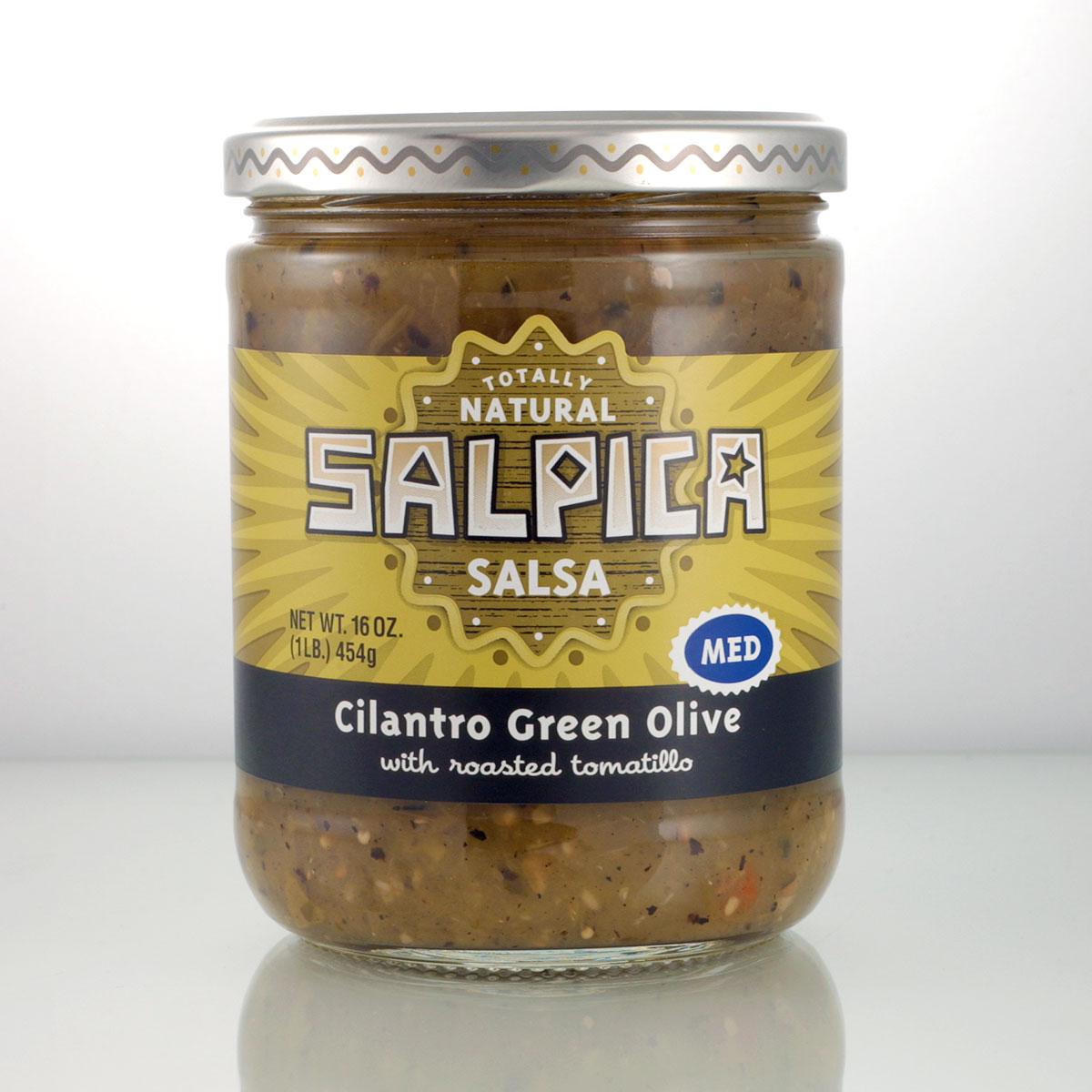
Cilantro Green Olive / Salsa label in gold.
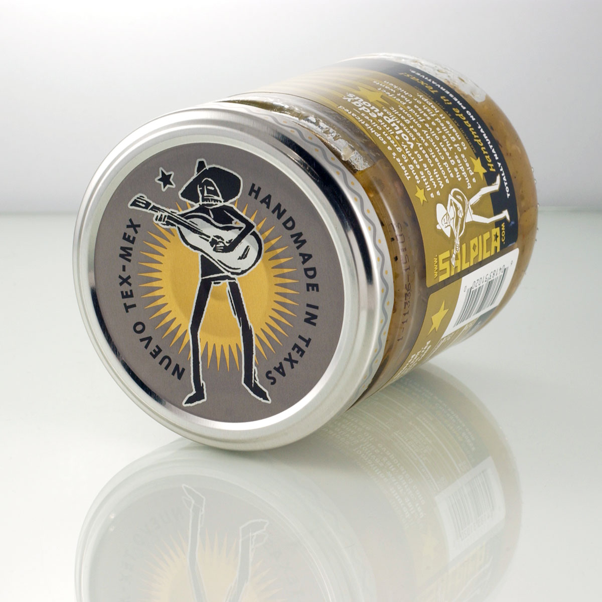
Lid detail / Illustration and decorative border.